Ways to improve list loading performance
As developers lists are one of the main things we work with, for no other reason than it is such a powerful data visualisation technique. We use it so much that it is second nature to dump a list of data on the screen. This is fine for users with good hardware devices and fast internet connection. But what about when we don't have the ideal scenario? In this article, we'll talk about some nice techniques we can use to improve user experience with lists on low-end devices or slow internet connection.
Pagination
Pagination in essentially divides up a long list of results in pages, then allow the user to see a subset of the results on each page. This is probably the most common way of dividing content into more manageable chunks so that only a small amount of data is requested, sent and displayed to the user. No doubt this will result in snappier user experience. This practice is easy to implement and easy to handle long lists on web pages. This technique became popular on desktop devices and is still on many sites today when a user might want to skip some content in the middle. For example, going from page 1 to page 5.

Lazy Loading
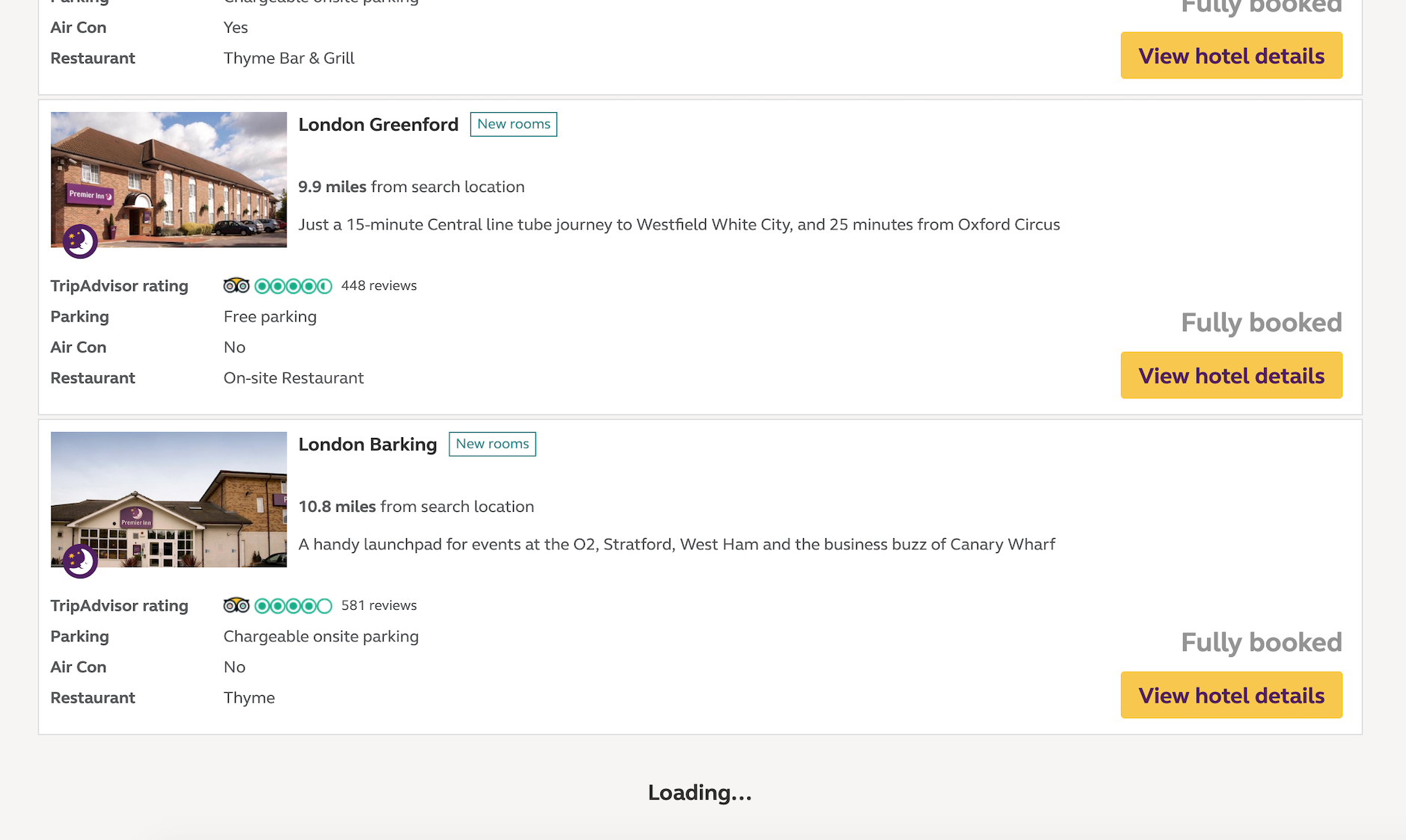
Lazy Loading is very similar to Pagination since you could achieve both with the same backend API. The difference here is how the user perceives the results and interact with it. With Lazy Loading, the user has to scroll to a particular position and then loading will be triggered and results loaded automatically. This allows the user to continue to browse without clicking on anything. Lazy Loading makes the most sense to be used in situations where the most relevant data is at the top and the user is not expected to want to skip any data in the middle. Or in some cases like twitter or facebook, these companies never want you to stop scrolling, so lazy loading will supply an endless amount of feeds as you continue to zombie-scroll.

(Screenshot taken from https://www.premierinn.com/gb/en/search.html)
Removal of content when it is outside of the viewport
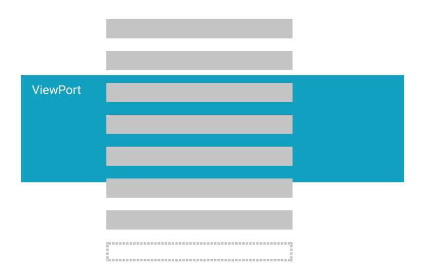
Now we are getting to the optimised list rendering territory. Since on low-end devices, memory is a key limitation, by switching out items for fake ones we are holding fewer data in memory and thus reduces RAM shortages on these devices.
This approach is just as it sounds when the list item is outside of the viewport then replace it with a fake item. When the user scrolls and the item come back into the item, then we'll do the opposite and replace the fake item with the real item again.
It is also recommended to keep 1 or 2 extra tiles off-screen, so when the user scrolls off-screen tiles into the viewport they don't constantly see images being re-downloaded.

A small case study
I am working on a project where we are developing web apps that sits inside a Cordova shell which runs on TV devices. The first thing to know about TV UI is that since these devices are designed to be used from far away, this means bigger UI and Text on the screen, therefore less on-screen content at a given time.
So why is Pagination and Lazy Loading not enough on TVs? Firstly there is the hardware limitation, this kind of apps often face performance issues due to the devices have lower specifications compared to laptops or even mid to high-end mobile devices. When devices try to load a long list, without doing any garbage collection it can consume too much RAM and result in a laggy device. By garbage collecting tiles off-screen, we can effectively reduce the amount of data held in memory, and when the user scrolls the item into viewport again we can simply re-render the item on the screen again.
Pre-fetching Lazy Loading
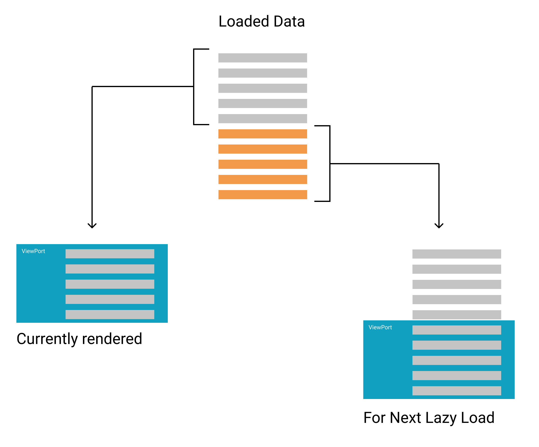
This optimisation might be useful for users with a slower internet connection. This technique essentially keeps extra data in memory that is not rendered out, and each time the user reaches to the bottom of the page, it will render out the extra data and pre-fetch more data for another future lazy load. The extra data is acting as a buffer. The whole point of this optimisation is to deliver a scroll behaviour that seems to the user where everything is loading in lightning speed. Something that might not be an issue for most people, but might be a nice optimisation to improve people's user journey on slower internet speeds.

For example, we can have a site that initially loads 20 items, but we only show 10 of them. When the user gets to the bottom of the 1 - 10 item list, it will try to show the next 10 items (11 - 20) which we already have data for. Since we already have the data, so we just need to render it out. What the pre-fetching means is that we will load the next 10 items (21 - 30) as we are rending out the items 11 - 20 on the screen. So by the time the user scroll down to the bottom again, we already have 21 - 30 ready.
Final words
Web app optimisation has become an interesting topic for me recently. Partly because I'm working with more low-end devices at the moment where performance is a serious factor to consider. More importantly, these are interesting challenges to tackle, as it requires better design and clever implementations instead of just dump a bunch of data on the screen. I hope this blog post will inspire some more optimised sites!
